 As we needed a logo for our merchandise I decided to create one.
 We wanted to create a logo that was simple, and easily recognisable. Before creating this logo, I looked at examples of logos from BMTH themselves.
Bring Me The Horizon have a symbol for each of their albums. The umbrella is the symbol for their latest album "That's The Spirit". The symbols are very simple and somehow unique, which is something we really wanted to aim for.
However, we wanted our logo to have the letters 'BMTH' in it, to make it even more linked to the band and have a better sense of branding on our website and social media. We will be using this logo for several things, especially our merchandise which will go up on our website.
 Some of the other bands I looked at involved "The XX", which have their very simple yet good logo because their is a clear sense of branding since their name is in the logo.
  Having the main idea in my head and knowing what I wanted to achieve, I began to sketch out some random shapes and symbols in order to get some ideas and inspiration. Since I am Art student, studying art at A-Level, this is always the way i start if I need to create something like a new logo. As you can see here on the right I tried out to combine the letters over each other so that it would look like a symbol but would actually be each individual letter B,M,T, and H. However, I didn't think this looked good and therefore I kept on drawing and I created the BMTH logo in a circle which is on the bottom left of the drawing.
  Now the next step was to create the logo on photoshop, I used Adobe CS5 as the Photoshop tool. First, I tried out the logo on paint, just to see how it would work and look, as I did not have photoshop available at home and started to do this research at home. However, in school we had Mac's available, which had the newest updated version of the Photoshop Adobe CS5.
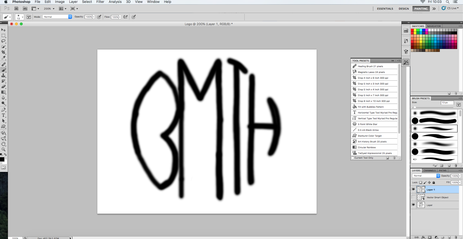
I found that the logo was very simple to create, by starting out with a circle, and then adding in the letters as I went along. The circle allowed it to look right. This on the left is the way it looked at the end when I had drawn up all of the letters. However, I didn't like it whit a black font and white background so I changed it.

This is the final version of the logo. I decided to have a white font and a white background, because black is more linked to the genre, compared to white and it also appears more ominous.
No comments:
Post a Comment
All comments are moderated and reviewed by the blog owner before publication.